Transparent Stickers: Design and Printing Guide
Design transparent stickers for glass and clear packaging with better contrast, intentional open areas and practical placement.
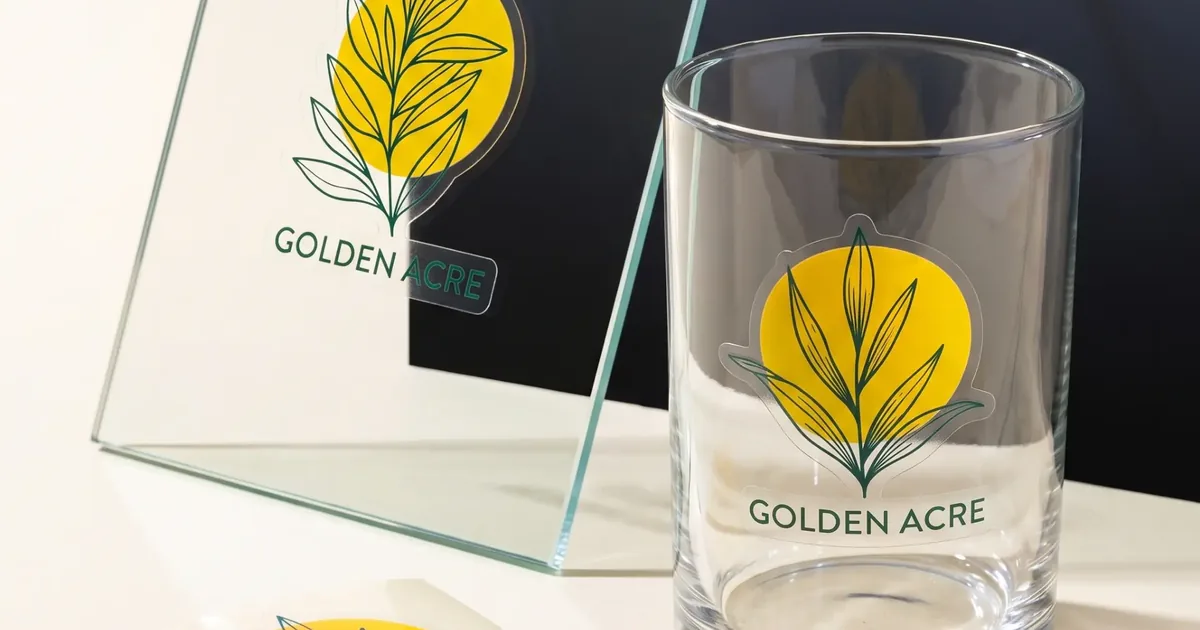
Transparent stickers let the package or surface become part of the design. They can look clean and minimal on glass, clear plastic and windows, but the background also changes how printed colours and text appear. Planning contrast is the key difference from designing on white material.
Design for the colour behind the sticker
A design shown on a white screen may look different on a dark bottle, coloured product or transparent window. Mock up the artwork on a photograph of the real container. If the background varies, important text may need a stronger printed base or a different placement.
Use open space deliberately
Transparent areas can reveal the product and create a premium, integrated appearance. They should be planned as part of the composition rather than treated as unused space. Keep edges simple and make sure fine transparent gaps will remain clear at the finished size.
- Glass jars and bottles
- Clear cosmetic containers
- Shop windows
- Transparent boxes
- Minimal logo applications
Prepare the surface before applying
Dust, grease, condensation and fingerprints can show through a clear sticker. Apply to a clean, dry surface and work from one side to reduce trapped air. For curved containers, test the chosen size to see how the film follows the shape.
Check the proof against a realistic mock-up
Review the actual sticker boundary, not only the printed elements. Confirm which areas are intended to remain transparent and how the design reads on the final surface. A simple paper outline can also help verify scale and positioning.