Holographic Stickers: Design Ideas and Best Uses
Discover how holographic stickers interact with colour, contrast and negative space, plus practical uses for premium brand packaging.
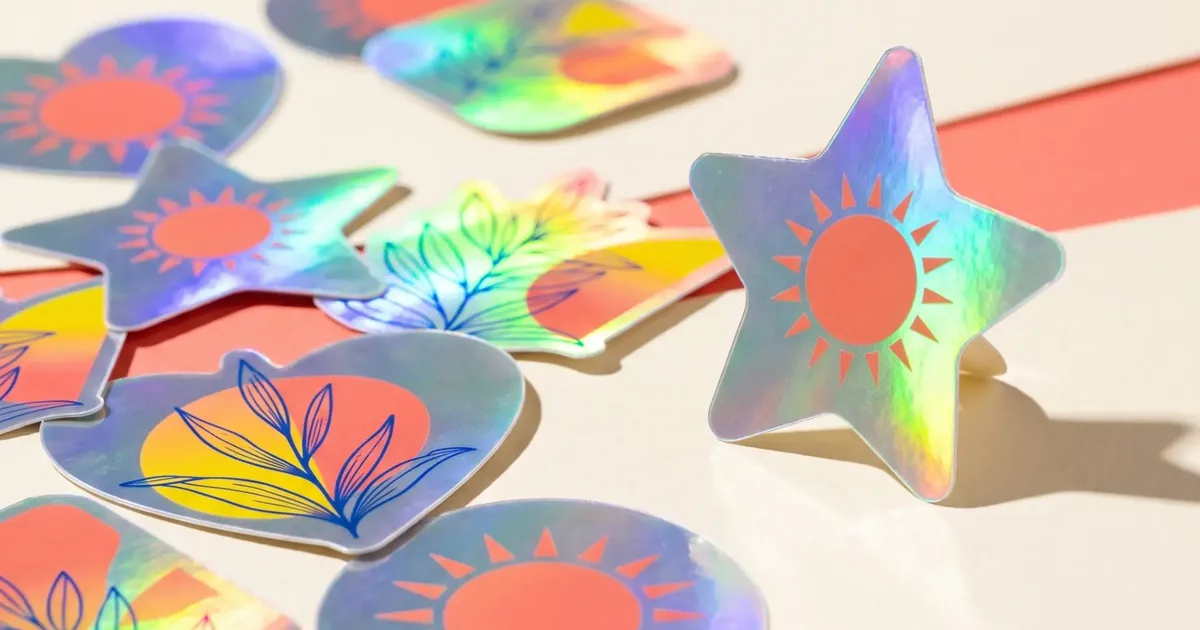
Holographic stickers shift colour as light and viewing angle change. That movement naturally attracts attention, but the effect works best when the artwork gives it room to appear. Strong shapes and controlled contrast usually communicate more clearly than designs filled with tiny details.
Design with the material, not over it
Think of the holographic surface as one of the design colours. Areas that allow the material to show can create highlights around a logo, border or illustration. Dense ink coverage can reduce the visible effect, while too much open holographic space may compete with the brand name.
Use contrast to protect readability
Dark, solid elements often remain easier to read against a changing reflective background. Keep small text limited and test the design under more than one lighting condition. Product details that must be read quickly may be better placed on a separate standard label.
- Bold logos and icons
- Simple character artwork
- Limited-edition seals
- Event giveaways
- Decorative accents on premium packaging
Choose placement carefully
Holographic material is most effective where light can reach it. A sticker hidden under a box flap will not deliver the same impact as one on a front panel, jar lid or insert. Consider whether reflections could make critical text harder to read from some angles.
Keep the premium effect purposeful
Use holographic stickers to signal a special range, launch or collectible element rather than automatically applying them everywhere. Repetition can reduce the sense of occasion. Pairing one reflective detail with restrained packaging can create a stronger focal point.